
Logo
Alternative variations of our logos can be downloaded in our logo library here.
HOOD FAMOUS BAKESHOP, PRIMARY LOGO, PNG
HOOD FAMOUS CAFE + BAR, PRIMARY LOGO, PNG
Guidelines
GENERAL
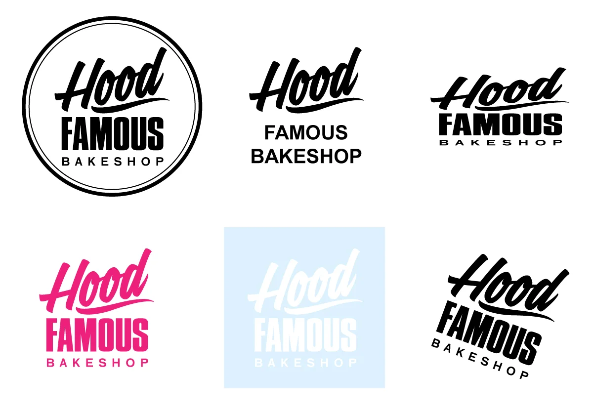
Our primary, or stacked, logos (above) for both the Bakeshop (Ballard) and Cafe + Bar (Chinatown-International District) should be used first and foremost wherever possible. When using the logo on a dark background, use the reversed (white) version of the logo. When using the logo on a photographic background, the photograph must have a value of at least 10% black before placing the reserved (white) logo over it to ensure the legibility of the logo.
Our secondary, or horizontal, logos found here should be used sparingly only when it is more appropriate than the primary stacked version in particular layout scenarios.
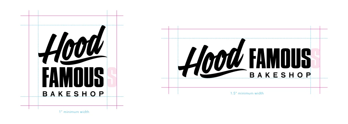
CLEAR SPACE + SIZING
We established and enforce clear space rules for the logo and it’s variations. Allow the pink lines the identify the clear space needed to surround and protect the logo. Clear space is relative, so we always base it off of the width of the “S” in “Famous”.
Minimum Size Usage
Do not allow our logo to be sized any less than 1-inch wide for the primary stacked version and 1.5-inch wide for the secondary horizontal version.
Do’s + Dont’s
Do use official hi-res logo files
Do use clear space rules
Do use minimum size rules
Don’t encase it in a shape
Don’t use different colors or patterns
Don’t use different fonts
Don’t stretch or distory
Don’t place it at an angle
Don’t use the reversed logo on a light background